The Document panel is the main content area where the artwork is displayed and edited using tools within the viewport. It's also where the node graph can be overlaid by pressing CtrlSpace. The viewport is for interactive, visual editing of the canvas. The node graph where you can inspect the underlying structure of the document and edit it in a more technical way if the need arises.
There is one instance of the Document panel per open document file. Each has its own tab labeled with its file name. When a document has unsaved changes, an * is included at the end of the name.
The Document panel is composed of three main areas:
- The top bar runs across the top of the panel and provides controls and view options.
- The shelf runs down the left of the panel and provides a selection of tools and nodes.
- The table fills the rest of the panel and contains the viewport and overlaid node graph.
The content of each depends if the viewport or node graph is visible, as described in the two sections below.
Interactive viewport editing
Top bar
While the viewport is visible, the left of the bar provides controls for the active tool and the right provides view options.
Editing modes
Only the default mode is currently implemented. Others will be added in the future and this dropdown is a placeholder for that.
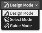
The default, Design Mode, is for directly editing the artwork.
Once implemented, Select Mode will be where marquee selections are made to constrain the active tool's edits to a masked area of choice.
Once implemented, Guide Mode will be for creating guides and constraint systems used for alignment and constraint-based layout.
Tool options
Provides controls for the active tool. These change with each tool, and are blank for some.

Pictured above is the tool options for the Select tool. It provides options related to its selection behavior and offers useful action buttons for modifying the selected layers with alignment, flipping, and (not-yet-implemented) boolean operations.
Each tool's options are described in the Tools chapter.
Viewport options
Shows options for how the viewport is displayed and interacted with.

| Snapping | When checked (default), drawing and dragging points and layers means they will snap to the alignment points that are visualized as blue overlayed dots/lines located at points of geometric interest within other layers. When unchecked, the selection moves freely. Fine-grained options are available by clicking the overflow button to access its options popover menu: 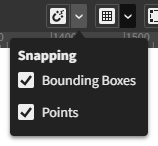
|
| Grid | Not yet implemented. This is a placeholder for upcoming grid alignment and snapping features. |
| Overlays | When checked (default), overlays are shown. When unchecked, they are hidden. Overlays are the contextual visualizations that appear in blue atop the viewport when using tools. |
| View Mode | Normal (default): The artwork is rendered normally. Outline: The artwork is rendered as a wireframe. Pixels (not implemented yet): The artwork is rendered as it would appear when exported as a bitmap image at 100% scale regardless of the viewport zoom level. |
| Zoom In | Zooms the viewport in to the next increment. |
| Zoom Out | Zooms the viewport out to the next increment. |
| Zoom to 100% | Resets the viewport zoom to 100% which matches the canvas and viewport pixel scale 1:1. |
| Viewport Zoom | Indicates the current zoom level of the viewport. |
Shelf
This bar runs vertically down the left side of the Document panel beside the table.
Tool shelf
Located at the top of the shelf area, the tool shelf provides a selection of tools for interactively editing the artwork.
Graph view button
Toggles the visibility of the overlaid node graph. It looks like this while closed:

Working colors
The working colors are the two colors used by the active tool. The upper circle is the primary color and the lower circle is the secondary color.

There are two buttons located underneath: Swap which reverses the primary and secondary colors, and Reset which resets the primary color to black and the secondary color to white.
Various tools provide choices for using the primary and secondary colors as controls in the tool options. For example, many vector tools have Fill and Stroke options that use the secondary and primary colors, respectively, as defaults:

These options each allow choices of being driven by the primary working color, secondary working color, or a custom color.
Table
The table contains the viewport bounded by rulers and scrollbars along its edges.
Rulers and scrollbars
The rulers, located along the top and left edges within the table, display the size and location of the viewport's visible region in canvas coordinates.
The scrollbars, located along the bottom and right edges within the table, allow scrolling the artwork to show different parts of the canvas in the viewport.
Viewport
The viewport is the view into the canvas. It is where the artwork is displayed and interactively edited using the tools.